When was the last time you looked at your YouTube channel? Open a new tab and have a look now. Do you only have a list of uploaded videos? Did you know that you can add more sections to drive more views and subscriptions? Today I am going to show you how to build and customise your YouTube Channel Layout. Follow the step by step guide below or watch the video.
Is your channel page looking a bit bare? Honestly, you will find that most channels look like this, just a list of uploaded videos. Don’t worry, after reading this post your channel will include so much more. Before we start you need to have already created a few playlists from your videos, if you aren’t sure how to create playlists check out this post here.
Step By Step Guide
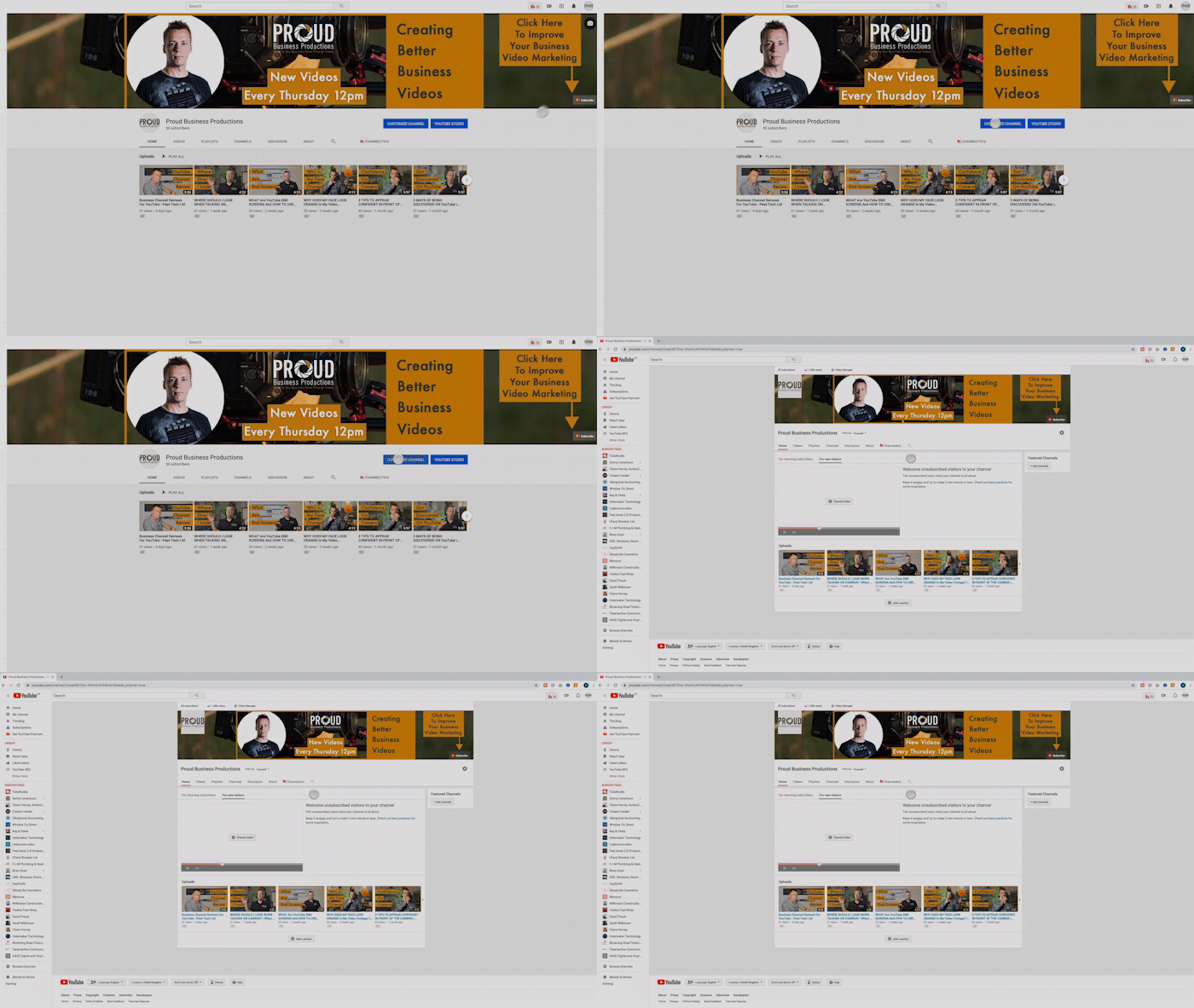
If we start on the YouTube homepage, click your thumbnail in the top right and click ‘Your channel’.
Click ‘Your channel’.
I promise my channel doesn’t normally look like this, I’ve set my channel back to default so that I can show you how it’s done. Pretty straight forward, click customise channel.
Add A Trailer
The first thing you will notice is an area to upload a trailer. A trailer should be about 30 seconds to a minute long. A good trailer will tell you viewer what content they should expect from your channel and why they should subscribe. If you haven’t created a trailer yet just pick one of your best-uploaded videos.
Add More Content
Next, we want to go to the bottom and select ‘Add a section’. Now if you click on ‘Content’ you will get a list of all the different types of content you can add to your page.
There are many types of content you can add.
Let’s run down the list:
We start with popular uploads, you can guess what this one is, a list of videos ordered by their view count. This is definitely a good one to add to your channel.
You automatically have an ‘Uploads’ section on your channel, this is basically a list of the last videos you have uploaded.
Liked videos are videos you have liked on other channels, I wouldn’t bother adding this.
Posted videos. Similar to uploads so you can ignore this one.
Live now, if you do a lot of live streaming this would be a good one to have up the top as it tells your viewers if you are currently streaming.
Upcoming live streams, if you have any scheduled live streams this is a great way to let your viewers know when they are happening.
Past live streams, if you want to separate your live streams from your normal videos.
This next section is what we are focusing on today, playlists.
Created playlists is a list of all your playlists.
Single playlists lets you show the videos from one playlist.
Saved playlists are playlists by other channels that you have saved.
Multiple playlists lets you pick certain playlists to show rather than showing them all like in created playlists, great if you have a number of playlists around a similar subject.
Posted playlists is similar to posted videos.
Finally, you can show all the channels you are subscribed to or feature specific channels, great if you work in partnership with other channels. For example, I will set this up to show my clients channels.
You can add recent activities and posts but these are features that are locked until you reach 1000 subscribers.
Building Out Your Channel
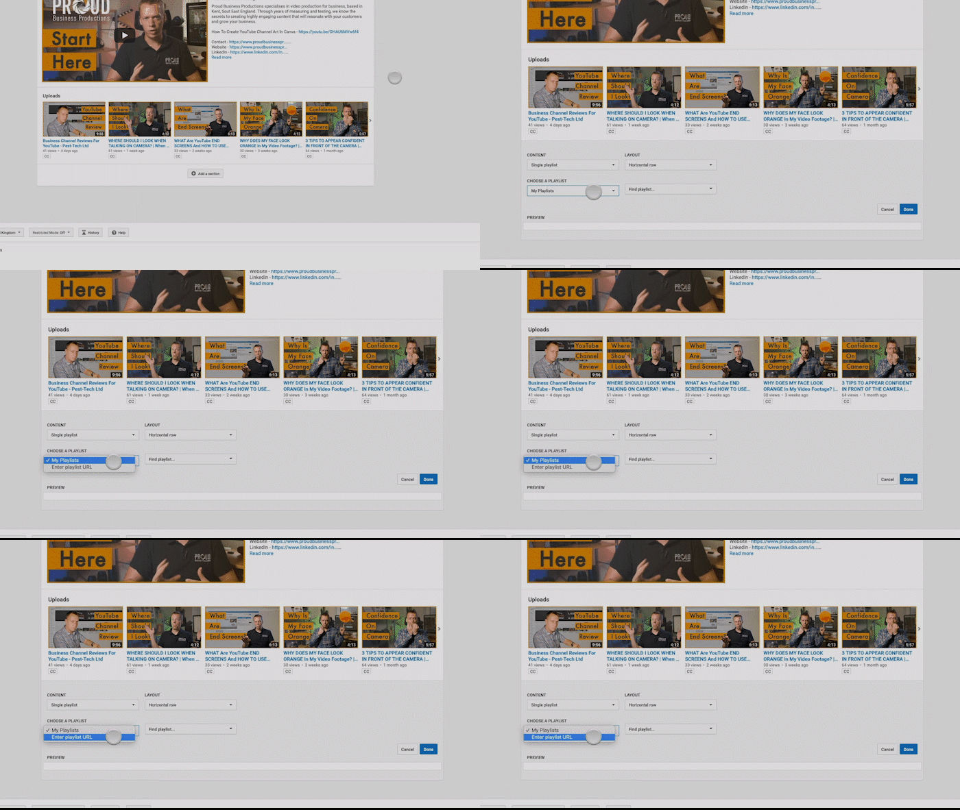
So let's get started on building your channel. The best element to have up the top is the playlist that best represents the content of your channel. So I will select ‘Single playlist’ I prefer using the horizontal row as I think it just looks a bit cleaner. You can use vertical just to break up the look of your channel and give certain content more space. I am going to be using one of my playlists but you can also use the URL of another channels playlist if you are a bit short on content at the start.
You can add a URL of another channels playlist
Finally I will click on ‘Find a playlist’ and select the playlist I want to add, click done to add the element.
Choose your playlist
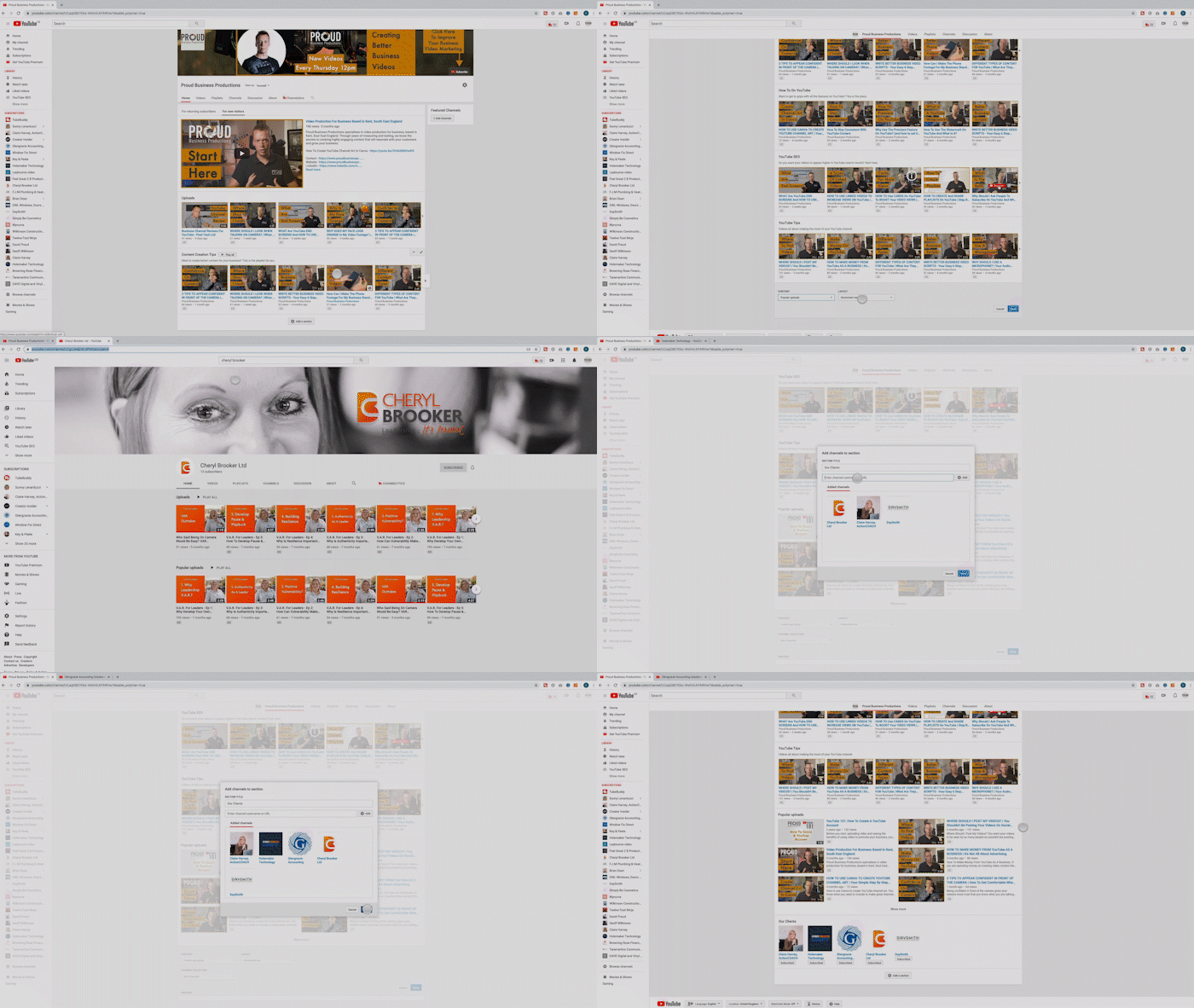
Let me just quickly add a few more playlists, a list of popular uploads and links to the channels of businesses I work for.
Build out the rest of your channel with more content.
Now all that is left to do is re-arrange them. To move an element around you can click on the arrows on the right-hand side to move it up or down.
Move the elements up and down.
I believe it is a good idea to have your best playlist at the top. After your channel trailer, you are basically telling the viewer ‘this is the content you need to watch’. Playlists are also one of the best ways to quickly increase views and watch time as it is easy for the viewer to just keep watching the next video.
My next tip is to keep all your playlists together. This helps keep your channel clean and tidy. The one thing I may put in the middle is the ‘Uploads’ section as this makes it easy for your viewer to find your most recent content.
After that it just a case of ordering as you see fit. You don’t have to worry about saving as this is done automatically.
A nice full channel.
And now you should have a nice full YouTube channel, how much better does that look than before.
That’s A Wrap
In summary, customising your YouTube channel layout tells your viewer that you have regular content and points them in the direction of what they should watch first. A channel trailer also tells your viewers what types of content to expect and why they should subscribe.
Have you found this useful? I have lots more YouTube tips in the blog section of my website.
Do you want to make sure your YouTube channel is bringing in profits for your business? Then make sure you check out our new video series ‘Your Essential YouTube Checklist - 5 ways to make sure your channel boosts your business’ right here!


